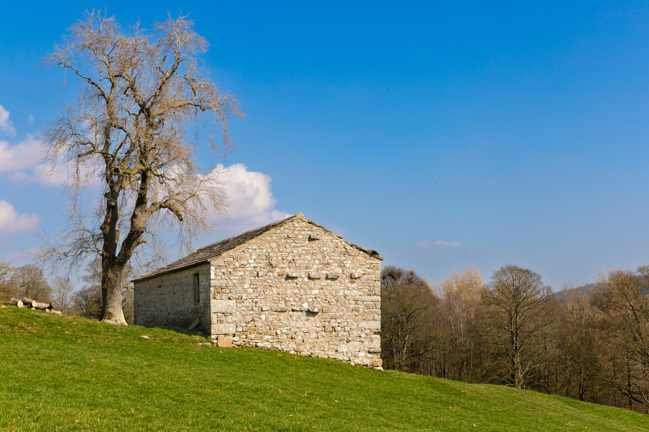
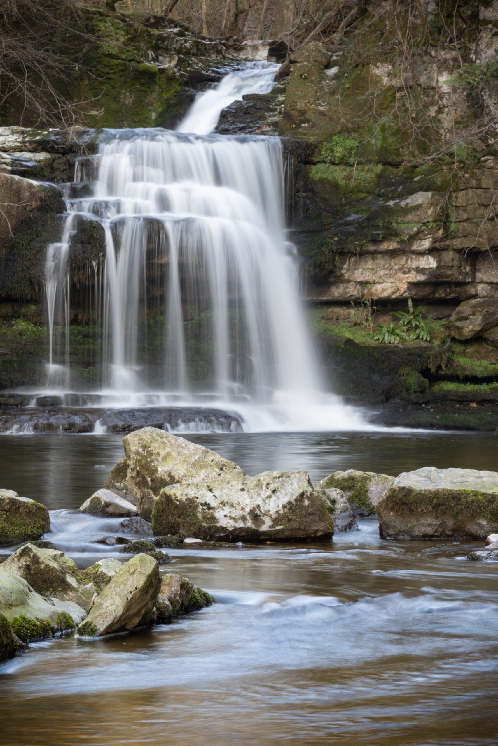
Two images from a themed competition tonight: ‘Less is more’:
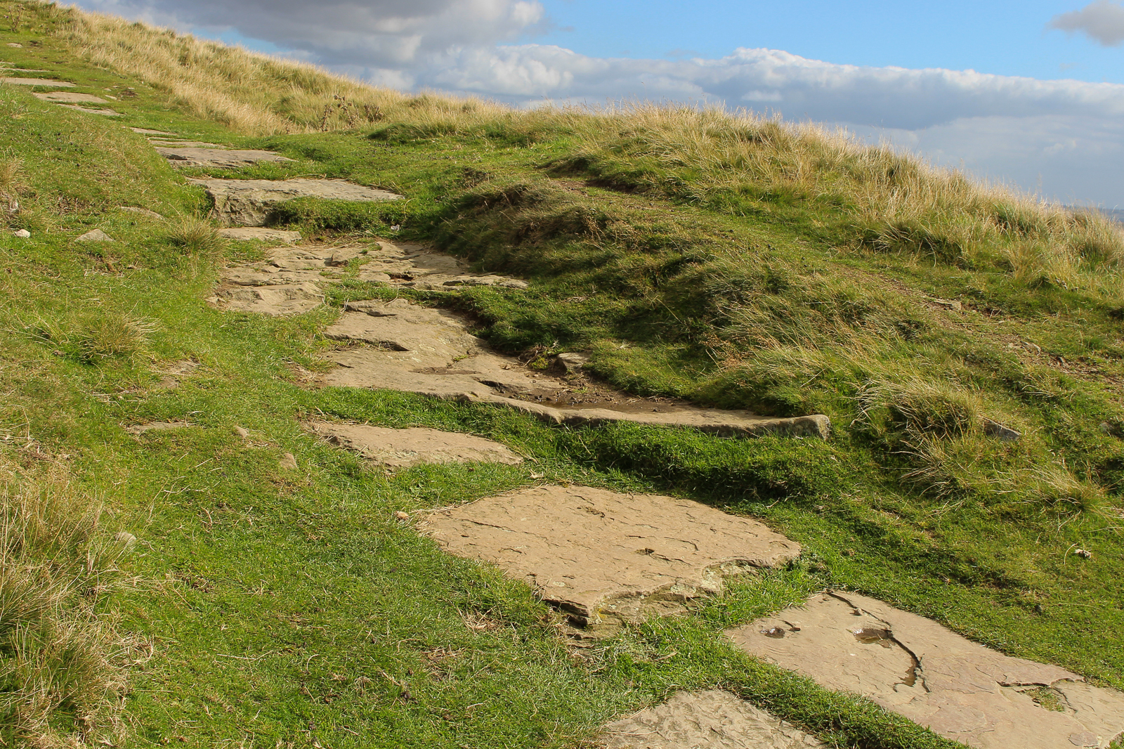
The judge felt that this image was too complete, and too complex to meet the brief. I think it needed the title to work at all as ‘less is more’, and that was a stretch too far. The judge also felt there is too much yellow in the grass. I have just done a small edit to remove that, and it does look better!
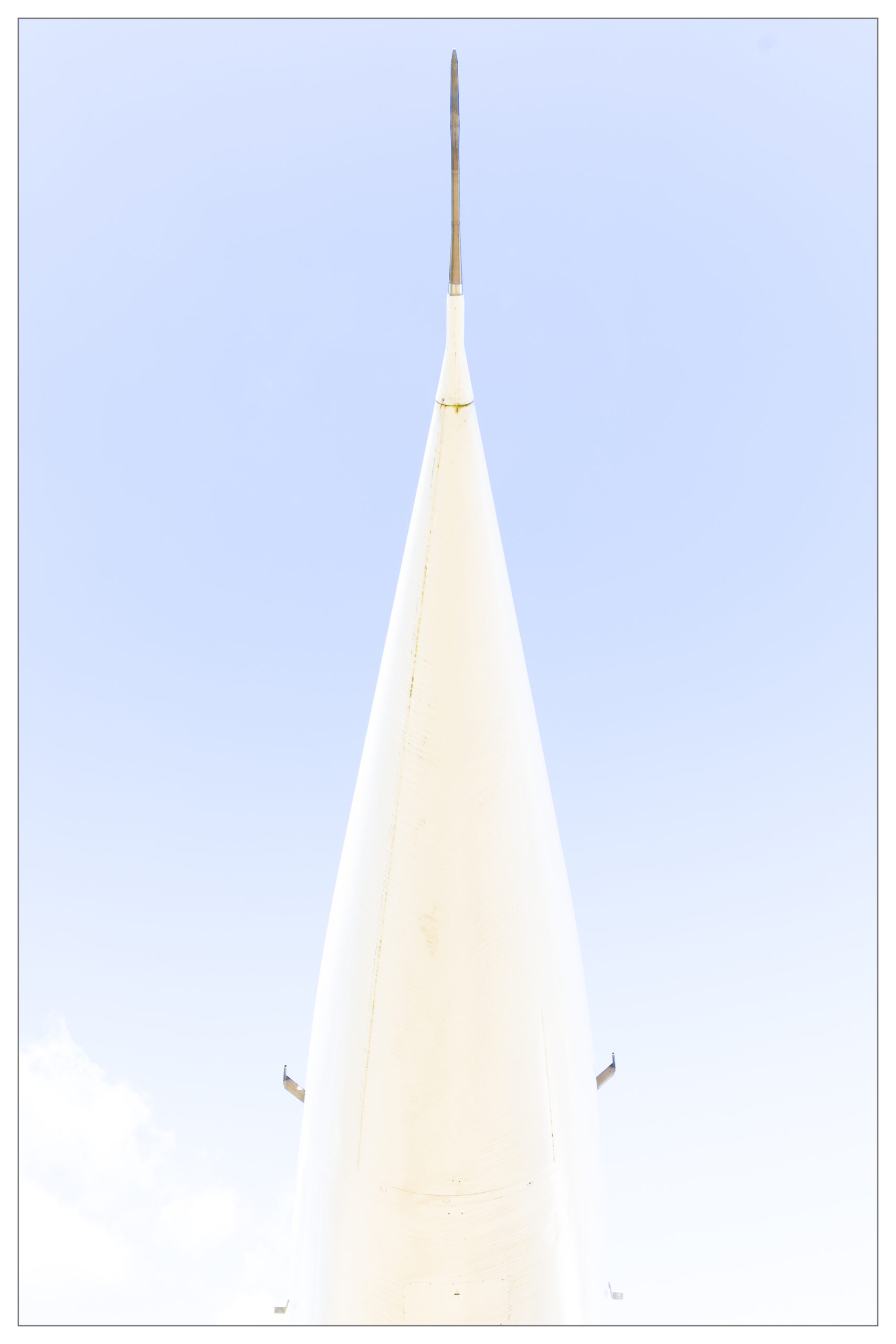
More successfully ‘on brief’ the judge felt this image worked well. The border was important, and the grey mount I showed the print in was also felt to add to the presentation.